Sunday, 16 October 2016

Project Post-mortem: The Black Swabian

 The black Swabian gown was made to wear for my divestiture as landed Baroness, completed in June 2016. For this gown, I was very inspired to try the highly embellished late 15th/ early 16th century Swabian style.

The main feature that drew me in is the interesting fashion of a-symmetric embellishment and sleeve ornament. I had to try it! However, rather than being an exact copy of one gown, I chose to play with a few design elements to create a hybrid gown that looks effective and is practical for events. (Pretty, but not uncomfortable)

Completed June 2016


References:
Portrait of Jakob Fugger and Sybille Artzt (detail)
Hans Burgkmair 1498
London, The Schroder Collection
    The gown worn in the portrait of Sybille Artzt and Jacob Fugger was my main source of inspiration and reference for the design. I particularly like the large brocade guards and of course the a-symmetric sleeve decoration. The frontal pleats are also a nice feature. As they seem to span the length of the bodice until they meet the guard (rather than originating under the bust as can be another variation in Swabian gown design), I felt this was a manageable design for my limited patterning skills and would allow more time to be spent on the fun embellishment bits!
    The neckline is also very interesting. The shape is unique, not running straight, but appearing to dip down in the front with no visible closure system to keep the neckline together above the bust line. The guard does not seem to come to below the bust, but rather mid-bust, with the pleats also extending to this point.
Portrait of Urslua Grekin
Ulm Master 1500
   This portrait served as the predominant reference for the sleeve design. The 3/4 length sleeve is both interesting and very practical. (Considering most SCA events end in having to do your dishes and doing this in long sleeves sucks!)
   The flow of the design and the coverage the deign takes on the sleeve is very attractive. Both portraits of Ursula Grekin (1500) and the aforementioned portrait of Sybille Artzt (1498) have designs that contain a central scroll motif encircling flowers and/or oak leaves. It is not entirely clear how these have been applied. The Artzt example seems to be gold edged and overlaid with pearls whereas the Grekin sleeve's scroll is red in colour and edged in pearls. This would indicate to me that the red could have been an applied piece or embroidered. Both examples use the pearls to indicate the edges of the scroll and enhance its shape and 3-dimensional quality. Interestingly on both examples the artist has painted the scrolls on the sleeve with 3-dimensional shading. This could support this being embroidered (adding a gradient of colour in the embroidery) or applied embroidered shading over an appliqued piece.
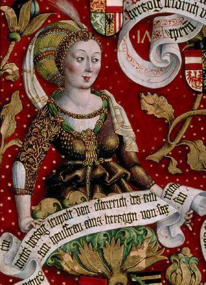
Detail from the Babenburg Family Tree tryptich
Hans Part 1489-1492
Klosterneuburg Monastery 
  Another example of a 3/4 sleeve. I referenced the opening at the elbow and sleeve lacing from this portrait. Also, the Babenburg example utilises spangles to fill gaps in the organic embellishment design on the sleeve, adding extra bling couldn't be wrong!
  This portrait helped confirm a couple of accessory quandaries also. Although the neckline is slightly different, this example shows a visible chemise line where the others do not. I am partial to this look. Both the Babenburg  and Grekin examples are worn with thin belts, approximately 1 in thick.

Unknown Portrait
  Unfortunately I could not find details for this portrait, however I've included it because it shows decorative outer bodice lacing. The previously mentioned interesting neckline of the Artzt gown perplexed me to the point that I decided to make the closure a feature with decorative lacing rings.

Details and Construction:

      For the body pattern itself, I modified my 15th c. Flemish kirtle blank, adding material to the two front panels for pleating, as the portraits feature a close fitted bodice with similar lines to the Flemish style. From what is visible in the reference images, it was sensible to construct the gown with no waist seam, adding gores to the skirt to achieve fullness in the skirt. The outer layer is a medium weight black wool to achieve a good weight and no sheen.

     I cut the guards on the bias, which was very effective for the skirts, but I did have a small amount of visible pulling on the bodice guards that I'm a little unhappy with. I tried using the lacing to create a similar neckline shape to the Artzt gown, where it comes down and in below the collar bone, then distinctly dips and meets mid-bust. I thought the top lacing point would create the 'points' at the top of the dip, but instead just pulls the neckline. Oh well. Food for thought. In future I will cut the desired shape into the neckline.

    In regards to the design on the sleeve, I appropriated design elements from a few of the above sources and tweaked them to be cheekily representative of SCAdian symbolism. (incorporating roses and the white belt.) I appliqued the white belt and roses, then embroidered detail and couched gold cord around the edges to give them definition. I lined the edges of the roses in small potato pearls and built the stems with round pearls. All of the above examples with embellishment seem to have floral/plant motifs whose stems are defined in pearls. Further, in the Grekin portrait there is a texture visible in the oak leaves themselves that seem to either indicate that the leaves were formed with either grouping pearls or gold beads (hard to tell because of the warm/yellow overtone of the portrait) or  perhaps they were formed with textured gold work? Either way I did not have the time for excessive beading in this project and so chose to applique the rose heads themselves and played with gold work on the rose leaves. I experimented with a clean, flat couched gold look on some leaves and couched twisted strands in small groups on others. These two techniques gave slightly different looks as they caught the light slightly differently, although if there had been more time to complete the project I would have liked to just use the cleaner technique and neaten up some of the leaves. For the belt ends, I used a thicker gold and couched a single strand, giving yet another different texture to the piece.
Side view

Back view

Front view

Lessons Learned and Thoughts:

   Now that it's done I'm pleased with the result, but as always there are places to improve. The fit of the body is good and it is definitely comfortable. Plus I could finally do my dishes without worrying about wetting my cuffs or trying to roll up a skin tight sleeve! I am not entirely happy with the fit of the sleeves. They could have been a little tighter.
   In future I will have to play with the pleating method for the front panel. I wanted the pleats set so they wouldn't shift and so I box pleated the two front panels (as the Artzt portrait does not appear to have stepped pleats, but rather even pleats of matching height) and tacked in the pleats. There are visible puckers left from setting in the pleats that are not seen in the portrait, so I wonder how I can achieve a smoother look through the pleating. Also, hooks and eyes have been used to close the bodice below the laces, but it is remarkably difficult to secure the top-most hook as it sits directly under the bust. So perhaps a bit more space in the bodice would help with this, although I really like the close fit, so maybe I could try a different top closure next time.
Another note for future, I should leave a bit more space in between my pearls so they will keep on line smoother. The tight placement of the pearls has made them bunch and has distorted the desired lines.

Thanks:

I had a lot of help getting this project complete in time to wear it to me divestiture as landed Baroness. Special thank you to Mistress Ursula von Memmingen for supplying spangles and chatting me through the project. Thank you and lots of love to Lady Foinnabhair inghean ui Mheadhra for making me an absolutely stunning chemise! Thank you, thank you, thank you to Baroness Linet of Falcon's Rest and Lady Sorcha le Breton for sitting with me and hemming for hours!! I literally put the last spangles on the morning of the event, so I am very grateful for the assistance I received.

Saturday, 24 September 2016

Artist Journal #1: Adventures with Silk, Gold and Oil


    Last year I became really inspired to try and emulate a more period texture and look for my banner works. One big allure of this was getting to work with gold leaf! I had come across some examples of standards that were not only painted, but gilded also (See examples below), giving extra sheen to the surface and creating a sumptuous aesthetic that I really want to emulate.
   I did a couple of small leafing tests to see what look it would achieve, how it compared to simple colour on silk, its flexibility and wear.

   What I found is that it was fairly easy to apply, the sheen it gave is fantastic and it is so fine and thin that the flexibility of the silk was not terribly affected by the gold, although it does retain fold marks if stored folded.

   Upon looking for more references in the British Library collection, I came across this illumination by Jean de Wavrin from Anciennes et nouvelles chroniques d'Angleterre, volume 1 Netherlands, S. (Bruges), 1471-1483, that depicts
a knight with a standard with gold lettering. Not only did this supply another reference for gold lettering on standards of the period, but there also appears to be distinct lines in the standard, that look fairly evenly spaced and could indicate that the media used to paint the banner affected the canvas or silk to retain heavy creases after being folded.

Detail fromAnciennes et nouvelles chroniques d'Angleterre
Jean de Wavrin, 1471-1483 Bruges
Illumination
British Library
http://www.bl.uk/catalogues/illuminatedmanuscripts


Battle standard of the Ghent civic militia emblazoned with the Maid of Ghent
Agnes vanden Bossche (attributed to), 1482 Bruges

9 x 3ft

Linen canvas, painted, silver leaf, silk fringe

Ghent City Museum, Ghent, Inventory Number 787
http://www.stamgent.be
Banner of the Guard, Spoils of the Battle of Nancy
1474-76, Burgundy
Silk taffeta, gold, painted (unknown composition), applied silk fringe
342 x 113cm
 St. Thaddeus Banner

My first attempt was a anachronistic version of an ecclesiastic vexillum depicting St. Thaddeus. I painted this in the modern dying method and then used modern gilding size to apply the gold leaf to the lettering around the border of the piece, as well as a diadem on St. Thaddeus.

Silk dye, gold leaf, Approx. 80 x 100cm, Completed 2014


Notes: I was very happy with the way this piece came out. The colours came out beautifully and the gold is just aesthetically awesome. It supports the desired aesthetic enormously, however I realised after seeing it flying that the fine silk becomes slightly translucent. I'm not terribly happy with that as it affects the impact of the colour and makes the detail of the design less visible.
    I attempted to create a fringe on the outside edges of the banner by fraying the dyed edges. This took some time and although it did create a lightweight fringing, again, it is not as full as the extant examples that are girt with adhered silk fringing.

Ursula's Guidon

My next project was a banner as a gift for a friend who was being elevated into the Order of the Laurel. For this project she supplied 3 meters of silk taffeta. I hunted for silk fringing, but had to settle for poly fringing, dying segments in order to get the alternating stripes that were common in Burgundian standards.

This banner loosely referenced the design features of a Burgundian Guidon (1474-76, Charles the Bold style. i.e. asymmetric triangular shape, single tail finish at 1m high x 3m in length) in order to make a beautiful statement piece that could carry her motto. As seen in the example above, the lettering of their standards was sometimes applied with gold leaf. Remnants of silver leaf also appear on the lion in the Maid of Ghent standard. (1482) Rather than making an exact copy, I have kept as close as possible with texture of the material and included her badge and device, replacing the saint and motto of the extant Burgundian examples.

Silk Taffeta, gold leaf, acrylic, applied fringe. 3x1m, Completed 2015
Detail during construction


Notes: The gold on silk taffeta really popped! The gold leaf does not affect the flexibility of the silk very much, which means the piece still retains a beautiful lightness. The richness of colour is very effective.

   I used acrylic paint for the black details. This is a modern compromise for the egg tempera or oil paints that were used in period banner production. I utilised this media for a couple of reasons. Firstly, because, I only had a few weeks to finish this project. The gold leaf took a lot of time to apply and it takes a day at a time for the gilding size to dry. So by the time I got to painting detail I did not have enough time for oil paints to dry completely, as it can take days at a time for oils to set, especially if the weather not conducive to the drying process.  Secondly, as previously stated, I am interested in recreating the aesthetic of extant banner design, rather than experimenting with the chemistry of period artworks. (As this is a massive rabbit hole that I would get lost in and  possibly never resurface.)

   The choice of media looks very effective, but results in a heavier banner than the modern resist method, which means it does not fly on a breeze. This is not terribly important, but it is something that I like my standards to achieve, because it is a more satisfying finish. We expect a flag to fly in the breeze, but this standard would have to have a gale wind or be flown from a fast moving horse in order to see it fly.


   I had used gold leaf on a couple of other small projects and found that there was a step used by period painters that I had missed and has created an issue that needed solving. I hadn't been varnishing my gold! After taking my banners to long, wet events, leaving them out through rain and shine, some of the gold has begun to tarnish. I hadn't thought to varnish until this point because I have been using imitation gold leaf and had not thought it would react to moisture in this way.
Tarnished gold
   Cennini does describe this as a necessary step in Il Libro dell'Arte, stating,
"... But you must (varnish them) afterward; because sometimes these banners, which are made for churches, get carried outdoors in the rain; and therefore you must take care to get a good clear varnish..."
- Cennino d’Andrea Cennini,‘Il Libro dell’ Arte’ (The Craftsman’s Handbook)  Translated by Daniel V. Thompson Jr, Pg.104


   So in light of this, I decided to do a small test piece to test the flexibility, weight and finish of both varnished gold and oil paint on silk on both sides, following Cennini's methods of stretching and applying a thin layer of gesso to prime the silk on both sides, then scraping it down to a fine, smooth surface before applying paint, gold then finally varnishing the gold.


 Notes: The results of this experiment conformed a couple of theories I've had for a while. The texture that the oil paint provided was not dissimilar to that which I was achieving with acrylic. However it did take as long as 4 days for a layer of oil to dry. The oil paints left some brush strokes, which would not give a desired look to compliment the very flat style of 15th century pieces. Perhaps a thinning medium would assist, but that is one downfall of modern oils.

The quality of colour the oils supplied was very nice and the quality paint provided a good coverage with less need for time consuming repeat coats which are described as the process used to paint in egg tempera. Egg tempera being the predominant method used of painted banners before the introduction of oil paints in the 15th century.

   The finish of the piece was slightly rigid, but not unmovable. It retained creases and I believe on a full scale piece would be quite heavy on the silk.

   The varnished gold was slightly more rigid than before varnishing, but its texture was very similar to the painted section. No cracking is apparent on the piece after much folding and playing. This could be due to the varnish coat being only very fine.

   One surprise bonus to following Cennini's instructions of prepping and priming the silk for gilding was that the finish of the gold on this test is much smoother than my previous attempts. The banners I have been gilding have had the gold applied directly to the silk. This method worked fine, but the texture of the fabric was visible through the gold, as the leaf conformed to the texture of the fabric. When priming the silk with gesso and scraping it back to a flat surface, you clog the openings between the fibers of the silk, leaving a perfectly smooth carrier for the gold leaf, the result of which is a perfectly smooth gold coating with even higher sheen. Very exciting!


Friday, 23 September 2016

Tracing is Not a Sin! They Did it, So Should You


And here's why...

How many times have we drawn up a design for a reproduction piece or medieval inspired work and found that it just doesn't look quite right? You rework it and rework it, but it just never looks the same as the image that your copying. This can be attributed to two things.

Firstly, personal style does come into play. Our muscle memory as artists means we have practised drawing the human figure possibly more than anything else and we have done so in a specific way. Our contemporary style may not mesh with that of the artists of the Middle Ages. It could be you have a scratchy graphic sketching style or maybe it's differing proportions, but like any habit, this is hard to break.

Secondly and possibly more importantly, the modern eye does not replicate form in the same style as the Medieval and Renaissance masters. Now of course, our eyes do technically see the same, however if we simply look at a period piece and try to replicate it from eye, it will always be slightly different or disproportional.

This is because in contemporary art practice we use different techniques in order to gain realistic proportion and we will usually adjust our drawings automatically to look more lifelike. Although during the 15th century artists sought to gain a sense of verisimilitude in their works, capturing a good sense of realism, even down to including the seam lines in garments, they had not yet gained the knowledge and tools to practise perfect perspective. This would come into play in the 16th century during the Italian Renaissance when mathematical knowledge would come back to Europe through trade with the Middle East, however in the era of Van Eyck and van der Weyden perspective and proportion were captured by eye. This is most apparent in architectural landscape and also in the proportion of figures. Many of the human subjects always seem to have legs for miles and many have very similar yet distinct facial features, being slightly more rounded than the style currently in vogue in contemporary art. So although we intend to copy a piece closely, if we attempt this by eye, we will inevitably change features that make the design look authentic.

However, when it comes to tracing in order to get a perfect reproduction you should remember, they did it in period! In Cennino D' Andrea Cennini's manual Il Libro dell' Arte (The Craftsman's Handbook), written in the late 14th / early 15th Century, there is a guide for the construction and use of tracing paper to copy scenes of fragments for reproduction. These chapters are as follow...
A free version of Il Libro dell' Arte can be found at http://www.noteaccess.com/Texts/Cennini/


"How you May Obtain the Essence of a Good Figure or Drawing with Tracing Paper.
Chapter XXIII
You should be aware that there is also a paper known as tracing paper which may be very useful to you. To copy a head, or a figure, or a half figure, as you find it attractive, by the hand of the great masters, and to get the outlines right, from paper, panel, or wall, which you want to take right off, put this tracing paper over the figure or drawing, fastening it nicely at the four corners with a little red or green wax. Because of the transparency of the tracing paper, the figure or drawing underneath immediately shows through, in such shape and manner that you see it clearly. Then take either a pen cut quite fine or a fine brush of fine minever; and you may proceed to pick out with ink the outlines and accents of the drawing underneath; and in general to touch in shadows as far as you can see to do it. And then, lifting off the paper, you may touch it up with any high lights and reliefs, as you please.


The First Way to Learn How to Make a Clear Tracing Paper.
Chapter XXIIII
If you do not find any ready-made, you will need to make some of this tracing paper in this way. Take a kid parchment and give it to a parchment worker; and have it scraped so much that it barely holds together. And have him take care to scrape it evenly. It is transparent of itself. If you want it more transparent, take some clear and fine linseed oil; and smear it with some of this oil on a piece of cotton. Let it dry thoroughly, for the space of several days; and it will be perfect and good. [p. 13]


A Second Way to Make Tracing Paper: With Glue.
Chapter XXV
If you want to make this tracing paper in another way, take a good smooth slab of marble or porphyry. Then get some fish glue and some leaf glue, which the druggists sell. Put them to soak in clear water, and arrange to have one porringerful of clear water to six leaves. Then boil it until it is all melted, and after boiling strain it two or three times. Then take this size, all strained, melted, and warm, and a brush; and lay it on these slabs just the way you tint tinted papers. The slabs must be clean; and they should be greased with olive oil previously. And when this size which is laid on them has dried, take the point of a penknife, and start to pry this size far enough away from the slab here and there for you to get a grip on the skin or paper thus formed. And work cautiously, so as to pry this skin off the slab in the form of a paper, without damaging it. And if you want to find this skin or paper [more durable][17] before you pry it off the slab, take some linseed oil, boiled the way I shall teach you for mordants; and with a soft brush lay a coat of it all over. And let it dry for two or three days, and it will be good tracing paper.


How to make Tracing Paper out of Paper.
Chapter XXVI
This same tracing paper which we have been discussing may be made out of paper, the paper, to begin with, being made very thin, smooth, and quite white. Then grease this paper with linseed oil, as described above. It becomes transparent, and it is good.


How you Should Endeavor to Copy and Draw After as Few masters as Possible
Chapter XXVII
Now you must forge ahead again, so that you may pursue the course of this theory. You have made your tinted papers; the next thing is to draw. You should adopt this method. Having first practiced [p. 14] drawing for a while as I have taught you above, that is, on a little panel, take pains and pleasure in constantly copying the best things which you can find done by the hand of great masters. And if you are in a place where many good masters have been, so much the better for you. But I give you this advice: take care to select the best one every time, and the one who has the greatest reputation. And, as you go on from day to day, it will be against nature if you do not get some grasp of his style and of his spirit. For if you undertake to copy after one master today and after another one tomorrow, you will not acquire the style of either one or the other, and you will inevitably, through enthusiasm, become capricious, because each style will be distracting your mind. You will try to work in this man's way today, and in the other's tomorrow, and so you will not get either of them right. If you follow the course of one man through constant practice, your intelligence would have to be crude indeed for you not to get some nourishment from it. Then you will find, if nature has granted you any imagination at all, that you will eventually acquire a style individual to yourself, and it cannot help being good; because your hand and your mind, being always accustomed to gather flowers, would ill know how to pluck thorns."


- C. Cennini, D.V. Thompson, The Craftsman’s Handbook;“Ïl Libro dell’Arte”


As a practical example I have based a few reproductions on this version of St. Michael in Rogier van der Weyden's Last Judgement Tryptych, in its closed position. I love his serenity and the graceful pose. I have painted colour versions of this particular St. Michael in two projects, once from eye and once by taking a tracing.


Last Judgement Triptych (closed) ((detail))
Hans Memling
1467-71
National Museum of Gdansk

     Below are my two attempts. The right side is a colour sketch that I took from eye, the left a basic traced framework for transferring later. The proportions of the trace are far closer than my first attempt. As you can see, I have shortened his legs and narrowed the face slightly almost automatically even though I was attempting to copy the image exactly.

    When taking a trace of a well shaded piece, it is advisable to not only trace the details, but also consider marking out the integral shading and shadows with a dotted line. This will assist in later stages of your reproduction as the lighting and shade of a form inevitably forms the three-dimensionality and appearance of that form. 

Left: Tracing,  Right: Sketched from eye

From these two mock up sketches, I did two paintings of St. Michael. Again, the detail on the right was copied from eye both referring back to the original and the sketch I had done previously, and the figure on the left was painted using the tracing of St. Michael as the basic framework to start from and paint over.

Although neither is perfect, the rendition painted using the tracing  is closer proportionally than the other. And although the version taken from a tracing began as a basic copy, it lends opportunity for originality and still requires the skills of colour, shade and tone in order to create a piece that is passable for the style of the Northern masters.

Painted St. Michael again attempted from eye.
Pavise designed and prepped using the tracing taken from the original.


Another perk of taking tracings of period art for modern projects is tracing paper allows you to easily reuse figures, reverse them and enlarge them for use in a range of projects. So always keep your tracings! You never know when you'll need them again.


Dyed Silk Banner; St. Michael design taken from the same tracing.

Painted Silk for Potent Pageantry: Modern Silk Resist Dying


One of the common methods used to display personal heraldry within the SCA is making banners by resisting and dying lightweight silks. Although there is speculation that this method may have been used in Asia in the Middle Ages, dyed silk banners are not period for Medieval European cultures. However, his method is convenient and creates a hard wearing, lightweight piece that is easy to store and transport. Dyed silk banners float well on a breeze unlike heavy appliqued banners and the method of applying resist and dying your banner is also a faster process. Another consideration that falls in favor of the dyed silk is that it produces banners with a consistent flexible finish that lasts and is not in danger of cracking or peeling as is possible with a more accurate painted banner. 
The method of stretching silk in a frame and painting it on both sides is a period practice of 15th century painters (Outlined in Cennini's Il Libro dell Árte Pg106-107) and this practice is consistent for both painted and dyed banners, however a more period practice would be to paint in egg tempera or oil paints (as were developed in the mid-15th century). However these materials are subject to wear and cracking through time and excess use as the carrier for the work is flexible, unlike the well preserved panels. Extant examples of painted military banners show extreme wear. Being that the average SCA banner would be pulled out and used on a much more regular basis than their period predecessors, one may find the modern process of dying silk banners more desirable.
What follows is an overview of how to create sturdy silk banners using the resist/dying method.


Materials:
·         Silk (10 or 12 Momme Habutai is the best)
·         Meter ruler
·         Measuring tape
·         Pencil and eraser or erasable pen
·         Masking tape
·         Safety pins
·         Rubber bands
·         Frame for stretching (Cheap galvanised shelving works well. Just use one side of the structure without shelves, and if need be you can use the supports from the other side to enlarge your frame.)
·         Sable paintbrushes large, medium, and fine (Soft bristle)
·         One stiff bristle brush
·         Paper towels
·         Gutta (Available from art or craft stores)
·         Silk dye (‘Setasilk’ also available at art and craft stores)
·         Water


Drawing Up:
Find a large surface to lay out your silk and tape it down using masking tape. At this point you will want to measure out and rule up the geometric aspects of your device. Don’t worry about your charges yet. They are easiest drawn when your silk is in the frame. Be sure to tape down your silk nice and even, ensuring that it hasn’t pulled more to one side. This will ensure you come out with strait lines.
*Hint* When you are drawing up standards or pennons there is a trick you can use to get an even curve and save fabric and time by painting two standards or pennons at once!
Method: Cut the length of silk to the desired length of your standards/pennons. Measure your silk on the short sides and make six even marks across the width of your silk on both ends. Be sure they are even on both ends and leave about an inch away from the long edges to allow space for safety pins. To get even tapers on your standards, rule from mark 1 on the left side to mark 2 on the right. Then draw a line from 4 left to 3 right and 5 left to 6 right.

 
This is also a good time to draw up the shape of your tail.


Now it’s time to stretch your silk in the frame. For this we will need safety pins and rubber bands. If you use the galvanized shelving then there will be holes ready for you to loop the rubber bands through, but if you are using a solid frame, you can just as easily slip two rubber bands together and loop them around your frame.
Evenly place safety pins around the perimeter of your silk. If your frame is not large enough to fit your whole piece of silk, (which most of the time it won’t be) feel free to do it in sections.
To stretch silk loop the rubber bands around the safety pins, starting with the corners and progressing evenly across the piece. I recommend placing the corners, then the centers and so on, to ensure an even stretch

 
Feel your silk and ensure that it is tightly stretched. If you push down on it should snap back into place. If this does not occur your silk is too loose and you must move your pins until the silk is sufficiently stretched. This is integral to the next step. If your silk is loose The gutta will not penetrate the silk and your dye will not travel as far and will bleed through the lines.


Now you can draw your charges. It’s much easier to draw up detail on stretched silk. Have your charge pre-enlarged to the size you will need. The silk is translucent, so you can trace your image through it. Just place the photocopy or drawing below your silk. Should you be using shelving bracket or any frame that raises the silk, you will need to turn the frame over so the silk faces the drawing, but remember that if you turn your frame over you will need to invert your charge.


*Hint* I recommend using tracing paper and redrawing your charge to size using a bold texter. This way if you need to invert your design, it’s as easy as turning over your drawing.


Applying Resist:
Applying gutta is probably your most fiddly job. Be careful when applying gutta to your silk. It is permanent, so if you make a mistake or smudge it, there’s really no fixing it.
To apply gutta, all you have to do is squeeze it out over your lines. This takes a lot of patience as you don’t want a smudgy line, but you also don’t want your line to be too thin. The way gutta works is it penetrates the fibers of the silk and clogs them, so moisture will not continue running through the lines. So ensure that your line is a sufficient barrier. This will include checking all of your joins between lines and corners to make sure they are all connected.
*Hint* Be sure to begin drawing at the furthest point from where you’re sitting and work towards yourself. It is always tempting to start right in front of you, but you can only do so much before you are leaning your hand precariously over your wet gutta, and smudging becomes immanent!
Allow your gutta to fully dry before moving your frame, moving the silk through the frame or applying the dye. Gutta dries faster depending on the temperature so the old hairdryer trick will come in handy!
Should you smudge your gutta, you can occasionally use your stiff bristle brush and water to scrub the gutta out of your silk. Hold some paper towels on the back to soak up the excess water. This results in more of a grey spot than a wiped black mark.
Remember to gutta in your outline for the shape of the standard too.


Applying Dye:
Once your entire piece has had gutta applied and dry (gutta is not entirely watertight until it is dry) you can start dyeing. Use your soft sable hair brushes to apply dye, as they hold more moisture. When applying dye, don’t paint right next to the line. The dye runs freely through stretched silk, so apply your dye about an inch away from your guttaed line and allow it to seep up to the line. Continue coating your silk. Attempt not to leave any edges of the dye for too long, as they dry and leave a mark. This will occur if you are painting a piece which is larger than your frame. In this case attempt to not stop in the same places on the second coat.
Allow dye to dry between coats and shifting. One coat of dye will give you a light colouring, for vibrant results, two coats is optimal. On the second coat, the dye does not run as readily as the first. I recommend using stiff bristle chisel brushes for coat number two.
Once again this is messy business and spills can occur. Is you spill dye in an area it will begin to spread, so while painting keep your paper towels, water and stiff bristle brush handy. When you spill, quickly place your paper towel on the underside of the stain and get your wet brush scrubbing the dye through the silk and into the paper towel. Be sure to keep adding more water to the brush to ensure you get out as much dye as possible. This is not a perfect fix, there will still be a slight stain and usually an outline of the spill, but it helps. 


Finishing off:
·         Iron Setting:
Your items painted in Setasilk will need to be set using an iron. Iron on the high cotton setting with no steam. Use a pillow case or sheet that you won’t mind getting dirty to cover your standard as you iron. Iron over the covered standard to set.
·         Hemming
You can do this one of two ways. You can hem it by hand and sew a tube hoist using a whip stitch. I don’t recommend machine sewing standards as they are delicate and also fiddly in the machine.
OR
For an easy alternative you can pick up some fray stopper and paint it around your edges before cutting the piece out. For an easy hoist you can machine sew cotton webbing sandwiched around the edge of your chief and sew two or three eyelets into the edge. Thread laces through the eyelets that will tie around your banner pole.

            You have now successfully completed a beautiful piece of personal pageantry!


Other Useful Links:

The Barony of Southron Gaard Baronial Banner Project Page

The Gutenberg School of Scribes: Advanced Techniques in Silk Banner Painting